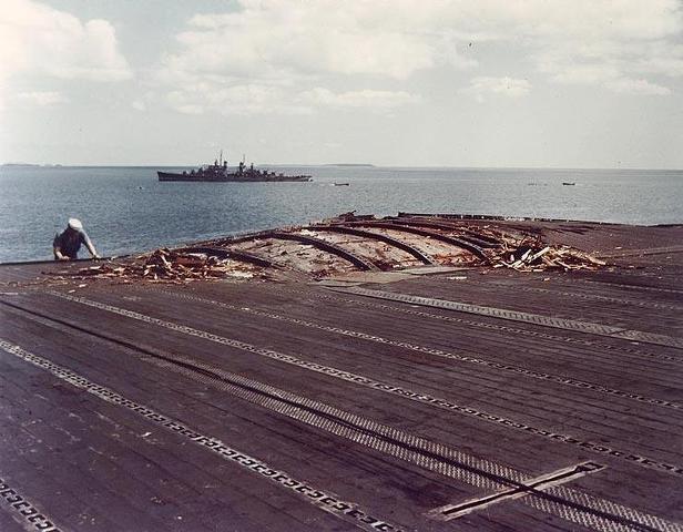
I know this as well, since I did some of my own negative and print processing in the early 1970s from my own Nikon F2S. Unless the negative processing is messed up, the major "adjustments" to photo differences are the camera settings ... back when the photographer HAD to set them himself (not easy to do in combat) ... and in the print processing. I found that depending on the enlarger exposure time, paper type, and how careful the person is in processing the print, the contrast and even sharpness can change the appearance of prints made from the negative. I have several times come across prints in 80-G at NARA of the same photo in different places ... sometimes as many as THREE different prints ... and the contrast of the prints can and normally are different due to when they were produced. I posted the above two images earlier in this forum just to illustrate what a difference can be seen in photos. The USN paint WASN'T flat, it had reflectance, so bright sunlight would lighten the appearance of a ship quite a bit.
During WWII we don't talk about it much here, but there were two types of negatives in use during WWII ... Panchromatic and Orthochromatic each had different sensitivities to different wavelengths. I can't remember which is which, but one film type showed "yellow" as dark and the other showed it as "near white". Since Yellow Chromate was a common primer used by the USN to touch-up exposed metal areas, you can see that the difference in appearance can be confusing to observers of prints. Looking at color photos taken during WWII many times will show clearly the use of primer touched up spots, that stand out clearly. In grayscale they may only appear as a light area or a dark area. Unfortunately, it is nearly impossible to know which negative film was used in a given photo.
Anyway, I'm not the one in this discussion fixated on whether the cruiser is a "light" or "dark" ship. I only consider light vs dark when there are multiple ships in the view and the paint used on at least one ship is known. I generally don't try to declare the paint of a ship based on a grayscale print. An impossible task as far as I'm concerned particularly during a period when the USN was changing their camo. But, things like where there is a ship known to have a high contrast scheme certainly can be seen in decent photos. Seeing the scheme pattern is one good way to ID a ship by comparing to known photos of ships of the same type, even if the colors are unknown. Lack of that contrast on a ship that had a high contrast scheme tells me that it has been painted over with something different. An example of an interesting study of different "camo paint" is this view of the USN anchorage at Argentia in October 1941. It is difficult to reproduce this image here with the size limits of Photobucket and this website, but you do get the idea that the USN at the time was experimenting with a LOT of different paints and schemes prior to Pearl Harbor just from the contrasts seen between the ships. Try are ships in Ms 1, various original Ms 12, some look to be painted with likely 5-S.

 ). The photos were cataloged out of true sequence. I have arranged them in the order that they were taken. Taken note that USS RUSSELL transferred wounded HORNET survivors at 0803-0931 and at 1650-1845 on 27 October 1942. USS JUNEAU returned to the Task Force from the USS ENTERPRISE Task Force at about 1230. (these times come from USS NORTHAMPTON and USS JUNEAU War Diaries) On 28 October, more crewmen from HORNET were transferred at 1250-1309 and at 1530-1625.