Sutho wrote:
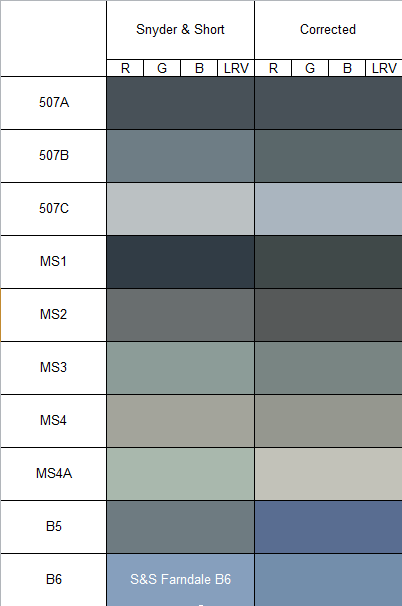
I am not sure if I am onto something here but again with that "periodic table of colours" I have again converted it to Black and White in Adobe Photoshop and taken patches of what was recorded to be the "unchallenged" colours HMS Belfast was supposed to be painted in. I cross referenced them with the correct year on the chart. I put B6 in as B30 and 507C in as well as B5. I made the mistake of labelling 507A as G5 when I misread the wrong column.
The scheme may be correct by accident, but it is highly unlikely to be a combination of pre-April 1943 Pattern 507s and Standard Camouflage Colours plus post-April 1943 B&G series. It will either be MS1, 507A, B5, B6 and 507C designations, or it will be G5, G10, B15, B30 and G45 designations - assuming the colours themselves are identified correctly which I haven't looked in to.
Lindsay and I have been toying with relative tonal analysis offline and whilst it does work to a degree as you can see, it's hard to draw definitive conclusions from it.
It may have been A.E. Schuil who has left behind archived records discussing in 1941/42 how hard it is to photograph relative tone faithfully. Infact he went as far as to list the necessary conditions to be satisfied in order to be able to use photographs for assessment of relative tone and we agreed that in practise those conditions could not be met.
It does still provide an indication though. What you have done is demonstrate why I have had to change most of the colours even if the Snyder & Short versions were close in characteristics. When converted to black and white their relative tones are all wrong as compared to documented numerical values in the archives.
The Snyder & Short ones will never properly reconcile with reality in tone, and hence, all interpretations of colour schemes based on the Alan Raven / Snyder & Short colours are suspect.
One cannot correctly state "this looks like X, Y and Z" if one's understanding of X, Y and Z is incorrect.