Hello again,
I have been silent for a long time, and purposefully so. The more I started digging, the more I questioned the established thoughts on what these RN WW2 shades looked like. All I wanted to do was to paint my 1/350 PoW in reasonable colours. What a journey this has been. I now know what the possible shades looked like, and many look nothing like people have led us to believe. Dick sent me the AD29 data for PRS's analysis of the paint samples sent to them by Admiralty (PRS AD29 15 Oct 42, on NA 212/124) . He challenged me to convert them, and with Bruce Lindbloom's assistance, I did that. Jamie took that information onboard in revising Colourcoats, and what we have now is much better than what we had before.
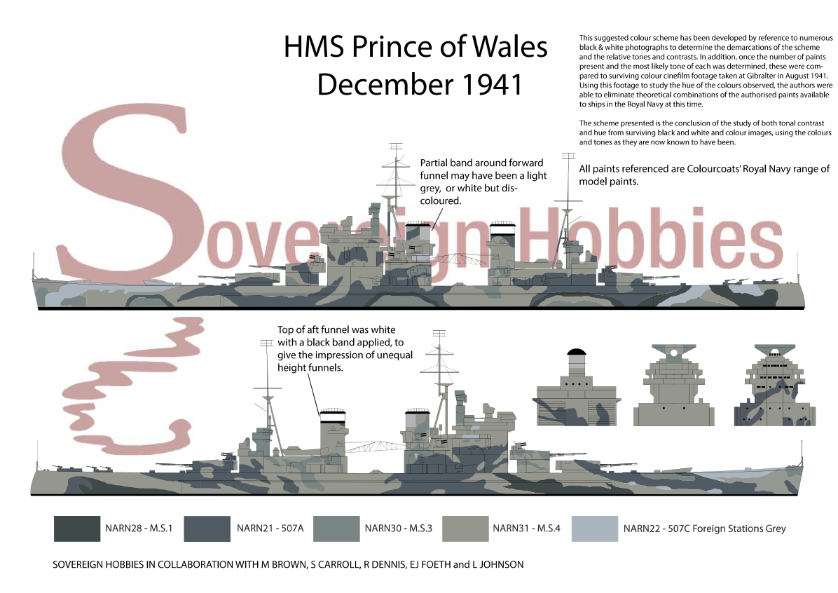
We put a lot of work into the PoW scheme that Jamie put forward (MS1, 507A, MS3, MS4, 507C). It looks a lot like the colours in EJ's wonderful graphic, though the paint designators are different. Is it right? Who can say. Until we find the design sheet for PoW, we can't have any level of certainty; and to be frank, even if you know the intended shades, you still don't know exactly what went on the ship because administrative commanders had some leeway in adjusting designs, and until the standardisation of paint in 2106/43 and CB3098(R), variances in the quality of what was applied (in terms of tone and colour) may have been significant. The MS&B paint was mixed to match colour cards, there were no formulae issued, and devices like photometers to measure tone were relatively new devices and not readily available to ships staff. There is other evidence to show that there were problems mixing paint to match the desired shade before 2106/43, but I realise I am heading off topic, so won't bore you with that now.
The main reason for me posting is that I still see doubt in some that 507B was the same shade as 507A. The first thing that needs to be understood is that the designations '507A', '507B' and '507C' refer to a pattern, i.e. formulation, of paint, not to a shade (shade = colour + tone) of paint. 'Dark grey, Home Fleet shade' was a shade of paint, and it came in a number of formulae, two of which were 507B and 507A, as very clearly explained in AFO 211/39.
Attachment:
1939 1 19 AFO 211 507A 507B.jpg
As far back as AFO 1658/27 we are told that enamel is made to the shade of the paint, so if 507A is 'dark grey home fleet shade' without enamel, it is the same shade as 507B which is 'dark grey home fleet shade' with enamel that is the same shade as the paint. I can understand why people without the benefits of the www and with records still locked away would think that a 'B' paint was halfway between and 'A' and a 'C' paint, but that is quite simply the wrong assumption.
Attachment:
AFO 1658 27.png
I also noted a comment by Jamie re the perils of relying on imagery, and a quote from Schuil (optical scientist engaged by DTSD and seconded to Naval Section, CDCE, Leamington) that I had pointed him to. The document is RE CAM 30 1 1, and this is what Mr Schuil says...
Attachment:
re cam 30 1 1.png
I think it quite obvious from reading this that, if this is the quality of photograph needed for Leamington to make reasonable analysis of comparative tone, then our/my attempts to get meaning from the images that we have access to is a very hit and miss affair. There are many posts on this thread explaining the many, many variables that apply to image quality. I know that I fell into the trap of arguing the toss based on what I saw in images, and I apologise for that - I have come a long way since my amateur attempts at ship camouflage analyses two years ago. There is absolutely no way of saying with certainty that 'this must be that' from ANY image, colour or B&W, modern or historical, unless you have some scientific reference point, and even then, it will only be relevant for single point analysis as no one reference point can apply to every part of an image - too many variables. We took two years of comparing images, making allowances for colour balance problems in colour footage, et, etc to come up with the most likely shades on PoW, and even then, it is best guess.
I will end with a word of caution re WW2 paint samples. There still seems to be some reliance on analysing the colour of sample cards or physical paint samples from WW2. I can understand that - you get something physical like that in your hand and you think 'so this is really it!". But it isn't! Paints deteriorate. Oil paints darken and yellow unless kept under UV. Ultramarine pigment fades, whatever medium it is in. You only have to look at the formulae in 2106/43 to see that the proportions of thinners, oil, etc in each paint was different, so they would not age in proportion to each other. You are seeing how it looks now, not how it looked then. Here is what the Paint Research Station at Teddington had to say about how samples appeared after only a few weeks in dark storage - it is not hard to imagine what 70 years of storage might do...
Attachment:
212 124.png
Regards,
Lindsay