HMS Prince of Wales

Area for camouflage and painting questions

Moderators: MartinJQuinn, Timmy C, Gernot, Olaf Held, JWintjes

Post Reply
elcejay
Posts: 102
Joined: Sun Mar 30, 2014 3:33 am
Location: Brisbane. Australia

Re: HMS Prince of Wales

Post by elcejay »

Cag wrote:Hi All,

Thanks Lindsay, could you tell me what approx reflectance factor your match would produce please?

You are correct that all pre-war paints (And therefore their matched wartime matt emulsion types supplied by Duresco etc) had Admiralty Pattern blue black paste as part of their ingredients (Even the pre-war white had 8oz of 8p blue added IIRC) and so even Mediterranean grey was to some extent a light blue grey (If you read the book Alarm Starboard by Geoffrey Brooke he mentions that the when first sighted the battleship Bismarck looked fawny grey as opposed to the greys that the Royal Navy used which were much more blue).

It was just that the lighter colour on the HMS Devonshire colour image really puzzled me as it matched colours in other images (HMS Hood in colour posted earlier in this subject and also ships we know to be in 507b in B/W images seem similar in tone to the light tone on HMS Devonshire) and it confused me as to why (Easily done these days). If it was 507c I can see how it would look blue and understand the problems as regards lighting conditions etc, for some reason to me it just looked too dark and too blue! (Maybe I've got a new ailment, Purkinje eyes!)

Thanks to all for the help
Best wishes
Cag.

Hello Cag,

I saw it as blue too. It wasn't until I tested it (i.e. plugged it into scalemodeldb) that I realised what was happening visually. I find this all very challenging and very interesting. I go down a lot of blind alleys and have made a lot of errors, so am trying to take more care in presenting things on the forum. Thankfully this is a very patient audience and we seem to nut our way through with a few experts to guide us.

I am not sure how to determine the reflectance value, sorry. The hex code, approximately, is #a5b0b9. It equates to modern Munsell 2.5B 7/2, though that is a bit more blue than #a5b0b9. Other data on that hex code is here: http://encycolorpedia.com/a5b0b9. Perhaps someone more knowledgeable than me could give some assistance.

Were I to hazard a guess as to which paints we are seeing, I would say that I am comfortable with Raven's advice (http://www.shipcamouflage.com/3_1.htm) that it was 507A and 507C, unless there is evidence to the contrary.

Apologies if you have already read it, but in the above 'shipcamouflage' link, Raven tells us that:

'In April [1940] the captain and commander of the cruiser DEVONSHIRE (along wit[h] the participation of the Admiral) devised a particularly striking camouflage, one that they believed would offer a degree of concealment and disruption of identity. It consisted of a series of interleafed parallelograms running along the hull and into the upperworks. The colors employed were 507A and 507C.'

Regards,
Lindsay
elcejay
Posts: 102
Joined: Sun Mar 30, 2014 3:33 am
Location: Brisbane. Australia

Re: HMS Prince of Wales

Post by elcejay »

Hello all,

For discussion, I believe that we have mislabelled some of the panels on PoW's port bow. Two panels under the forward turrets and the bridge are marked as 'D', but if that is the case, they should show as darker than the 'D' panel forward of them, but they are actually lighter. I am fairly confident that both are 'E'.
Dumas010 edit.jpg
POW_01 edited.jpg
Relabelling to paint E 1.jpg


Regards,
Lindsay
You do not have the required permissions to view the files attached to this post.
Last edited by elcejay on Sat May 07, 2016 8:45 am, edited 1 time in total.
Cag
Posts: 229
Joined: Thu Dec 24, 2015 7:37 am

Re: HMS Prince of Wales

Post by Cag »

Hi All,

Thanks Dick for the posting of the Admiralty grey, I do see what you mean. I think I remember seeing on old WEM painting guides that turret tops, decks, and metal decks should be painted colourcoats 507a, could it be then that the colourcoats 507a is the non slip paint applied to these areas just mis-named/identified? (The mis-identification coming from the fact that the non slip paint also did come in 'Home Fleet Grey' as well as other shades?)

Thanks also to Lindsay, I've often thought that the port bow forepart could be a different colour, I thought at first that it may be an illusion due to the hull sheer at that point but noticed where the colours are in the same plane and therefore the same sort of light (Where the patterns follow onto the hull armour) they did seem a different tone. At first if it was different I did think it could be MS3 and those two panels being MS4 or 507c, or perhaps just MS4 and the two panels 507c as in some shots the wavy panel of 507c that runs along the upper deck edge and those two panels do seem the same tone (As well as the port side of A turret and the portside forepart of B turret) but I presumed I was again 'seeing things'.

However that proved a stumbling block in my attempts at hand painted camouflage schemes as the darker shades up for'ad near the bow and under the inverted 'U' shape have to be accounted for. I did think that if it was the MS4 and 507c option that it would be easily resolved as MS3 could still be used for these areas. I didn't think, however, there was enough contrast between the tones so reconsidered the possibility of it being MS3 but this poses the question as to what the darker panels for'ad were? (Possibly B5/507b but then that would have made a 6 colour pattern, MS1, MS2, B5, MS3, MS4, 507c and this option generally I think has been quashed)

I have gone over this area (As I did with the starboard side area that I posted a pic of earlier) and still cannot make up my mind, which as Sutho posted, is our problem, but thanks to your multiple patch testing we may at least resolve some issues so thanks for that.

As always best wishes,
Cag.
elcejay
Posts: 102
Joined: Sun Mar 30, 2014 3:33 am
Location: Brisbane. Australia

Re: HMS Prince of Wales

Post by elcejay »

Hello all,

This is my suggested relabelling of PoW port midships based on shade contrasts. My suggestions are the black paint identifiers.

I have added this input onto what I believe is one of EJs earlier working images - apologies if some of my suggested corrections have already been made, but I can't see a later version. I do note that Sutho seems to have used paint E in much the way I have suggested here on his model, so perhaps this has already been covered.

I also raise in the image a question about the apparent high level of reflection of paint A.
Relabelling with paint E.jpg
Regards,
Lindsay
You do not have the required permissions to view the files attached to this post.
EJFoeth
Posts: 2930
Joined: Wed Jan 21, 2009 1:51 pm

Re: HMS Prince of Wales

Post by EJFoeth »

A few comments

This image bottom left shows the region you have indicated as E; note that it is here much darker, as C has a tendency to do on some types of film (and E never does). So we can be fairly sure this is C.
POW_25.jpg
The tone of the lighter color below the turrets is not alwasy very clear, but from a comparison from various angles I can only conclude tone D.
POW_27.jpg
What I cannot clearly conclude is what lightest color was applied to the main turrets. Could be E on some, but the reflection angle for the turrets is unique, making it tricky.

You also need to be careful interpreting the top of the armored belt to the point you really cannot say anything unless you have a good close-up.
POW_28.jpg
Note how in the top image A has been repainted by B on the top of the armored belt only and how 'sloppy' the work is in the lower image with A running over the armored belt.
Cag
Posts: 229
Joined: Thu Dec 24, 2015 7:37 am

Re: HMS Prince of Wales

Post by Cag »

Hi All,

Thanks Evert-Jan those pics are, as always, very helpful especially the PoW 28 close ups.


I have used your PoW 27 to show the areas I'm unsure of which I hope you may be able to help with?
Best wishes
Cag.
You do not have the required permissions to view the files attached to this post.
elcejay
Posts: 102
Joined: Sun Mar 30, 2014 3:33 am
Location: Brisbane. Australia

Re: HMS Prince of Wales

Post by elcejay »

EJFoeth wrote:
You also need to be careful interpreting the top of the armored belt to the point you really cannot say anything unless you have a good close-up.
POW_28.jpg
Note how in the top image A has been repainted by B on the top of the armored belt only and how 'sloppy' the work is in the lower image with A running over the armored belt.
Thank you Evert-Jan - POW 28 answers my question about reflection perfectly.

I am still of the opinion that the panels I have relabelled to 'E' are E, but I am looking at other evidence at present.

Regards,
Lindsay
EJFoeth
Posts: 2930
Joined: Wed Jan 21, 2009 1:51 pm

Re: HMS Prince of Wales

Post by EJFoeth »

Cag wrote:I have used your PoW 27 to show the areas I'm unsure of which I hope you may be able to help with?
I think it help if we keep calling dark-to-light A-to-E... :big_grin: So your A/B or my D? What you have as A/B on the hull is all D IMO.

The top half of Im 27 shows the very light upperworks of the turret with a gradient towards the barbette thit indicates the turrrets where E.

In the image bottom right (patch below the fwd funnel on the waterline) you have A/B *my D), but I think this is C. IWM FL 17650 (bottom right) shows all tones C darker so that really helps
POW_26.jpg
elcejay wrote:I am still of the opinion that the panels I have relabelled to 'E' are E, but I am looking at other evidence at present.
More confusion is needed :smallsmile: Note E (my E) on the bow and E on the stern as a reference and how what I call D is D-ish all along the hull

Image
elcejay
Posts: 102
Joined: Sun Mar 30, 2014 3:33 am
Location: Brisbane. Australia

Re: HMS Prince of Wales

Post by elcejay »

Hello EJ,

To my eyes :scratch: your 'D' is actually 'E'ish along the hull.
pow10 e and d.jpg
The diagonal slash of E on the stern is a real throw-off. It gleams like a beacon in so many photos, and in the colour footage. In some photos, I think it is because it sits right beside A with both of them in enough quantity (in surface area) to play havoc on the camera. In photos where the sun doesn't play on it so much, it does not flare. This is a crop from one of the TIFF imgaes I posted a while back. I have indicated patches that look the same. The ones I have marked where the stern starts to curve sharply (and therefore further into shadow) are purely to point out (as you know) the problem with interpreting 'colours' on curved surfaces.
NH 67194-A PoW placentia cropped.jpg
Regards,
Lindsay
You do not have the required permissions to view the files attached to this post.
EJFoeth
Posts: 2930
Joined: Wed Jan 21, 2009 1:51 pm

Re: HMS Prince of Wales

Post by EJFoeth »

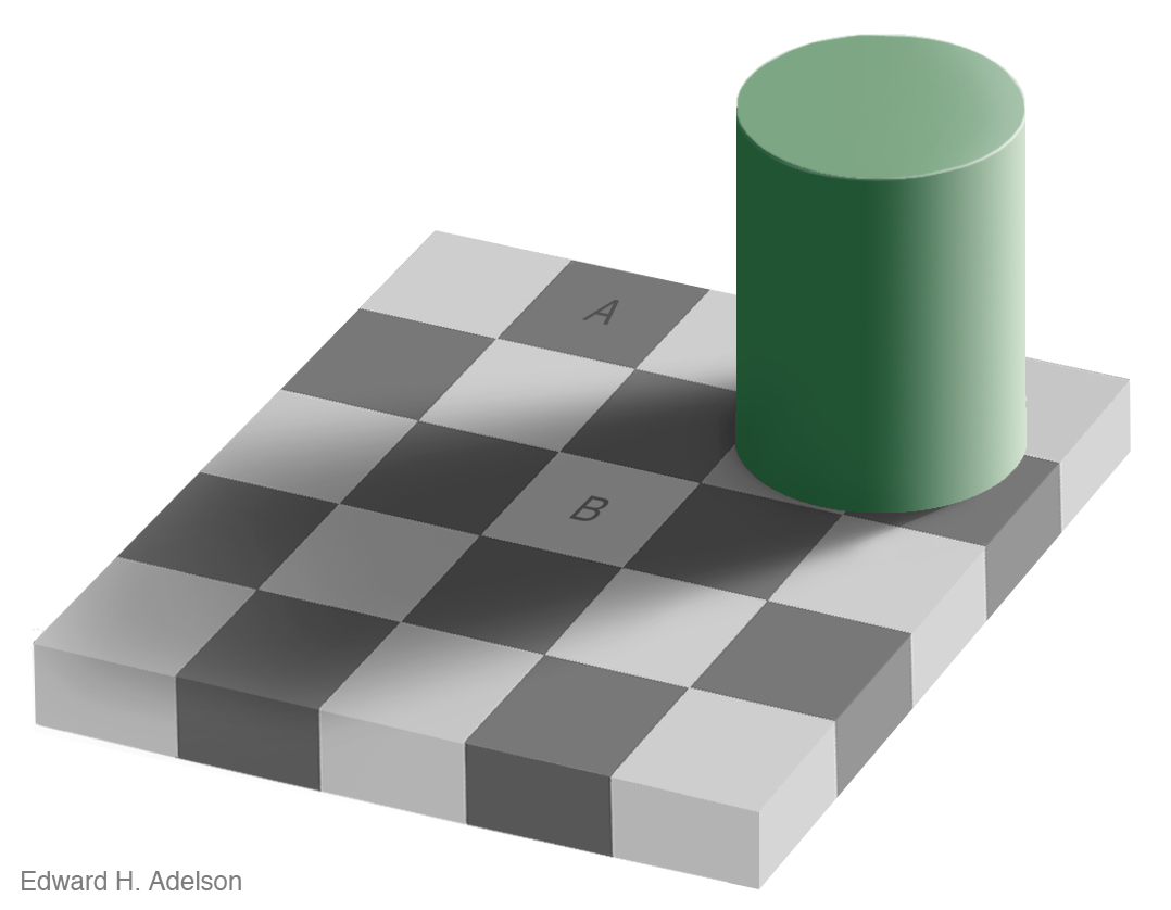
Be careful with gray scale values... I assume you know this wonderful example. Is A darker than B?

Image
elcejay
Posts: 102
Joined: Sun Mar 30, 2014 3:33 am
Location: Brisbane. Australia

Re: HMS Prince of Wales

Post by elcejay »

I hadn't seen that, but it actually supports what I am presenting, EJ.

If I went from eyeball, I would say that B was lighter, but I am not trusting my eyes. Here is what I do...
grey scale illusion.jpg
Were this a photograph, I would have worked out the direction of the light (difficult on many PoW photos) and determined what was in shadow and by home much (not exact, of course, but a reasoned attempt). I would know that A and B cannot in truth be the same colour because they are under different light. The fact that they return the same values would tell me that one is darker than the other. This is the methodology I have used for assessing the photos to discern 'E' from 'D' on the port panels.

Regards,
Lindsay
You do not have the required permissions to view the files attached to this post.
Last edited by elcejay on Sun May 08, 2016 10:16 am, edited 1 time in total.
EJFoeth
Posts: 2930
Joined: Wed Jan 21, 2009 1:51 pm

Re: HMS Prince of Wales

Post by EJFoeth »

These colors are the same (something I need Photoshop for to believe), but when you are interpreting contrast and you had to physically paint that block, than A is certainly darker than B with B modulated by the shade; photoshop is not going to help you there. :smallsmile:
elcejay
Posts: 102
Joined: Sun Mar 30, 2014 3:33 am
Location: Brisbane. Australia

Re: HMS Prince of Wales

Post by elcejay »

EJFoeth wrote:These colors are the same (something I need Photoshop for to believe), but when you are interpreting contrast and you had to physically paint that block, than A is certainly darker than B with B modulated by the shade; photoshop is not going to help you there. :smallsmile:
I am not sure that I understand your argument, sorry EJ.

You are pointing out an illusion in a computer generated image that makes us see two colours as different when they are the same. I get that. It is not a trap that I am falling into - quite the opposite. I am looking at photographs, not computer trickery. I trust the sun to shine and to create shadows. I trust the waves to scatter the light in many directions. I trust the reflection off the sea to throw blue onto the ship. I trust that the curves of the hull will play tricks with shadows and shades. I am looking for those tricks and trying to turn on them.

There is no illusory effect playing in the readings I have posted showing where I believe 'D' seems more likely to be 'E'. I am presenting readings taken from points in similar light so best to compare them. I take many samples from each point and do my best to recognise anomalous readings. I could argue with some reason that the illusion you presented is actually playing on people who see 'E' as 'D'. Here is another sampling of POW10 better showing the contrast between adjacent panels. It is not definitive, but it does suggest the possibility that the panels are 'E' as the contrast with B seems too great at most points.
pow10 e and d v2.jpg
Again, I am not saying I'm right that it is 'E', but I have yet to come across an image that causes me to drop the theory. I am still looking, and posted the finding in the hope of more evidence either way. I don't actually care if I am right or wrong. I just want to know!

Regards,
Lindsay
You do not have the required permissions to view the files attached to this post.
Cag
Posts: 229
Joined: Thu Dec 24, 2015 7:37 am

Re: HMS Prince of Wales

Post by Cag »

Hi All,

Thanks Evert-Jan I do see what you mean and as I say am in two minds as I still think I may be seeing things. I agree that we should stick to A-E sorry, my B would be either D (MS4) or E (507c) and correspondingly my A therefore would be C (MS3 if B is MS4) or D (MS4 if B is 507c).

Of course I did think that there was a colour difference on the port side too, so I have been wrong before but when Lindsay suggested seeing a difference on the starboard bow it did strike a chord.

I think a big problem is that there is a large chance that the ship was painted differently at different times and the scheme may have changed at various points which won't help. I have looked carefully at a lot of images posted and do see some patterns that do not seem to be shadows or light effects (I'll try to post them later) but again could be wrong.

May I ask a favour, Evert-Jan could you tell me where the bottom image of your PoW 28 comes from please? Thanks very much.

Best wishes
Cag.
EJFoeth
Posts: 2930
Joined: Wed Jan 21, 2009 1:51 pm

Re: HMS Prince of Wales

Post by EJFoeth »

Cag wrote:I think a big problem is that there is a large chance that the ship was painted differently at different times and the scheme may have changed at various points which won't help.
I know this is a factor with many of the early camouflage schemes (i.e., HMS QE), but I haven't seen a single image of HMS PoW that would support that. Tone C changes contrast and does so consistently on some photographs so I'd attribute that to the type of film used, and, other pics do not have the contrast to offer any appreciable tone difference between C & D and remain inconclusive.
Cag wrote:could you tell me where the bottom image of your PoW 28 comes from please?
It's from this image:

Image

I found a larger image in some war paper I found on Ebay and thought it was interesting!
biggles2
Posts: 1980
Joined: Thu May 30, 2013 1:50 pm

Re: HMS Prince of Wales

Post by biggles2 »

Interesting discussion, and after 22 pgs - no conclusion. What was POW's colors while in the Med in mid '41? Overall gray? :wave_1:
Cag
Posts: 229
Joined: Thu Dec 24, 2015 7:37 am

Re: HMS Prince of Wales

Post by Cag »

Hi All,

Hi Biggles yes you're right certainly interesting! I think the origional discussion has morphed into a general Royal Navy camouflage discussion and image interpretation as well, and I would say that you're also right, PoW was medium grey in the Med in September 41, and a few other shades of grey as well!

I think I didn't explain myself fully I'm sorry I meant that when we look at images we do not know the work that was going on with the ship and so at different times there would be a variation in the scheme, in some of the images we see booms and stages which usually mean 'painting ship'.

In ADM 499 the early film is mostly made up of these scenes of ship painting, there is the cleaning and scraping, the primer painting and the top coat painting. There is a good close up of the port bow area and the crew are painting the 'E' area at the deck edge, and painting the 'D' area below. We know at the bow there were two big 'blobs' of 'C' but in the film these are covered by other paint, which is backed up in some still shots where it is difficult to make out these 'blobs' and we see Jacobs ladders and planks around the bow.

Therefore in all the images it is hard to tell what we are seeing, worn paint to reveal previously painted and worn primer, just the worn paint, newly scraped paint, newly painted primer, newly painted top paint, or worn new paint etc. In her logs we see metion of crew cleaning paint, and of crew painting ship, sometimes on the same day as the crew being at sea doing gunnery practice.

Paint touch up was a continuous process whilst not at sea from what I read in the ships logs, as was make and mend, reading warrants and cleaning and maintaining ship. I do agree that in principle we can say that the overall scheme may have remained the same (And this is only an opinion) but the constant nature of wear and tear and repainting does add to the list of problems of identification.

I hope I have not been too negative, as I still believe that with the experts available, the research ongoing, help from companies such as Sovereign hobbies, etc an answer for the exact colours, their availability at certain periods, and their use will be found.

As always best wishes
Cag.
508medway
Posts: 179
Joined: Wed Dec 17, 2014 2:10 am
Location: Australia

Re: HMS Prince of Wales

Post by 508medway »

biggles2 wrote:Interesting discussion, and after 22 pgs - no conclusion. What was POW's colors while in the Med in mid '41? Overall gray? :wave_1:
How about 22 pages and 40 years? I found these whilst going through a May 1976 copy of Scale Models.

Does that magazine still exist?
You do not have the required permissions to view the files attached to this post.
Sutho
Posts: 449
Joined: Thu Dec 30, 2010 7:53 pm

Re: HMS Prince of Wales

Post by Sutho »

I have found some more colour photos doing online searches and am wondering what people think the colours are.

In the second photo down on that King George V class battleship yet again. There is a patch of paler blue behind the pom pom mount. I can assume the darker blue would have to be B5. The bottom photo shows a very dirty surface obscuring the paint which is another thing we need to consider that could be effecting the interpretation of paints. Again there is blue in that photo.

The top photo is an unknown D Day ship.
You do not have the required permissions to view the files attached to this post.
Sutho
Posts: 449
Joined: Thu Dec 30, 2010 7:53 pm

Re: HMS Prince of Wales

Post by Sutho »

Warship Perspective Series 1 to 4 state the information was compiled from eye witness accounts and interviews and information collected at the time.

[/quote] etc

Dear Sutho,

We are not using black and white photos to conclusively identify colour but to establish the number of different tones in a camouflage scheme, which were where in the design, and to establish a relative hierarchy of tones. In the main we are dealing with shades of grey and subtle blue greys and green greys not vivid reds and yellows so I don�t think we are at too much risk from the extreme effects that Linux highlights but one is conscious of that potential effect with certain colours. (Re the use of filters, we have probably seen these effects most clearly in the varied tones that Home Fleet grey appears in photos.) But we are basing our assessment on scores of images of the individual ship rather than any one photo, looking for a consistent number, positioning and hierarchy of tones.

The point of posting those three photos of KGV class battleship bridges was to highlight that, in the hierarchy of KGV�s 4 tone scheme, the panel high up on the starboard side of the bridge was the second darkest in the scheme (so it could not be B6 even if the scheme consisted of 507A, B5, B6 and 507C).

I agree with you about the �risks� of suggesting actual colours from B&W photos. It is a subjective judgement (guess sometimes) but it is based on our knowledge of which colours were available to the RN at the time and of their particular reflection factors, the camouflage practices of the time and whatever other contemporary evidence is available. But I don�t agree with your negativity about what the B&W and colour photos and film can tell us - I fear we will have to agree to disagree on that.

So, Warship Perspectives.

I have carefully read and re-read the author�s introduction but I don�t see any suggestion from him that every suggested camouflage scheme therein was compiled from eye witness accounts and information collected at the time. In particular he writes: �Photographs and there (sic) interpretation played a major role in this book��

The great tragedy is that with a couple of exceptions the author does not identify which suggestions for the colours in the schemes are based on what source (and if human, who was the source, what the source actually said - the level of detail, whether it was a contemporary note or a recollection decades afterwards etc (we know what tricks memories play) - so one can weigh it up) and which are based on interpretation of photos.

The author himself accepts his work �almost certainly contains errors� and we have already confirmed this in the case of Prince of Wales. The author states (Vol 4 page 28) that her camouflage applied in July 1941 consisted of 5 colours but that �By the time she sailed for the Far East in October 1941 the MS3 appears to have been painted out�. However we have seen that the 5 colours remained.

In the case of KGV, Anson and Howe (Vol 2 page 23) the author says their schemes consisted of 507A, B5, B6 and 507C, yet, to repeat, we have the solid evidence from the July 1942 Scapa observations reports that one of Anson�s two colours was MS1 and another was MS4:
162 - Copy.JPG
And then we have this from the observation report of 31 July 1942 when looking at KGV:
DSC_0120 - Copy (2).JPG
I suggest therefore that it is worth keeping a rather more open mind about Warship Perspectives. Some further illustrations of why:

In Vol 1 page 6 it is suggested that Gypsy and Glowworm were not in camouflage at the time of their loss whereas I have found that both were in dark hull/light upperworks at that time; it is suggested that Codrington was in a disruptive design during the Norwegian campaign and at the time of her loss in June 1940 whereas I have found that at Dunkirk and as sunk she was in overall Home Fleet grey with a false bow wave; on page 7 the medium tone on Grenade �stone� is described as �outside the official range of colours� whereas Stone is in fact listed in the Authorised List of Naval Stores (the Rate Book) of the era as AP 513 with its mixing instructions (see below); the photo on that page shows Sheffield rather than Southampton; on page 8 Garland is included in the list of those ships in the Home Fleet in the Flotta scheme which is unlikely as she stayed in the Mediterranean at the outbreak of war and did not return to the UK until September 1940 after the Flotta Scheme had been discontinued (and a photo taken at Haifa in mid-August 1940 shows her in overall light grey); on page 9 Glorious� flight deck is stated to have been �dark grey���!
AP 513.JPG
Warship Perspectives has had a significant impact on our thinking about RN WW2 camouflage but in the circumstances I hope you will understand that I don�t accept everything in those volumes as unquestioningly as I sense you do.[/quote]

I am open to reference material being incorrect. I have noticed some mistakes in warship perspectives myself and compiling such a detailed list of ship camouglage would be a difficult task for anyone.

I would love to see paint formulas on how the RN paints were mixed.

Short of any previous WEM staff admitting their paints are wrong I am still not ruling out their paint chips entirely. I am of the thinking that they would care more about history and would have revised their product if they had discovered a mistake yet they are adamant that their paint came from paint chips.

This forum has proven to me how wrong many reference books were about the pattern of Prince of Wales so it is just a matter of time before the paints fall into place.
Post Reply

Return to “Camouflage & Coatings”