HMS Prince of Wales

Area for camouflage and painting questions

Moderators: MartinJQuinn, Timmy C, Gernot, JWintjes, Olaf Held

Post Reply
dick
Posts: 677
Joined: Wed Oct 24, 2007 1:44 pm
Location: UK

Re: HMS Prince of Wales

Post by dick »

EJFoeth wrote:How do you match the color footage to B5 (contrary evidence)?
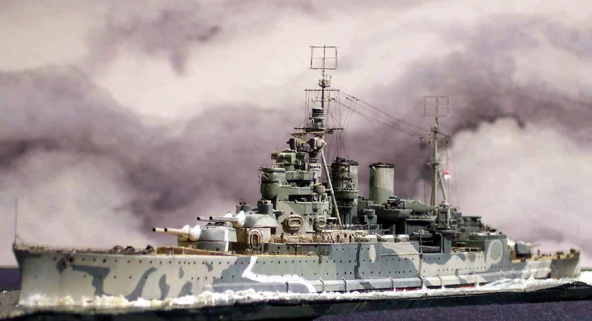
I see a blue hue to the grey panels in the colour film which I think were B5 so I see no contradiction.
EJFoeth wrote:....slightly lighter than on the color charts perhaps.
WEM B5 is lighter than MS2.

I base all my thinking on the appearance of WEM Colourcoats paints painted onto a 1/700 model. I place little faith in the tones of printed colour charts/diagrams/chips in books etc. (The exception would be the colour chips in WEM's reproductions.)

Even on a 1/700 model its remarkable how the same colour looks different, lighter and darker, on different places on the model ship according to the angle it is to light etc - exactly as in photos of the real ship.
EJFoeth wrote:BTW, what's the source on the image taken on the 23rd of October 1941?
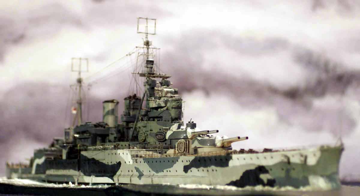
My version of that photo was given to me by Alan Raven. But you can also find it in the Art Nicholson book.
EJFoeth wrote:Here the two lighter panels amidships do look lighter than D.
Given the strong sunlight glare and poor photographer I don't think that this picture is a good guide.
Sutho
Posts: 449
Joined: Thu Dec 30, 2010 7:53 pm

Re: HMS Prince of Wales

Post by Sutho »

I think the B5 is where Raven has it and where it shows in the colour photo. That looks allot like B5 to me.

On a cruise now. I sailed within 5nm of the site of POW and Repulse which was nice to know.

I will make some modifications to my model when I get home and post photos. In most parts I will be changing B6 to MS3 and will assess what to change the other mystery colour to.

For informatio there is colour footage of the HMS Hood on youtube and even it in what I assume is 507B (close to B5) is darker than that suspected B5 alternate on POW.
EJFoeth
Posts: 2907
Joined: Wed Jan 21, 2009 1:51 pm

Re: HMS Prince of Wales

Post by EJFoeth »

From this film?

Image

This is 507B, no questions asked :smallsmile:
Sutho
Posts: 449
Joined: Thu Dec 30, 2010 7:53 pm

Re: HMS Prince of Wales

Post by Sutho »

Thats the film. We know that 507B is close in shade to B5. That is why I am sure that B5 in the colour POW film is the darkest shade after MS1 as the others seem too light for me. At least there are other colour films to compare quality to of the same time period.
Sutho
Posts: 449
Joined: Thu Dec 30, 2010 7:53 pm

Re: HMS Prince of Wales

Post by Sutho »

I am back from my holiday and will try to make some minor alterations to my models paint in a few days. I am just wondering if the following combination is possible:

A=MS1
B=B5
C=MS3
D=MS4
E=507C

What we know for certain is there is a greenish tint and whatever colour D is it is definately lighter than C which if is MS3 D needs to be ligter and also of greenish tint.

I have done a template very roughly of the hull pattern only and this is what I think the same shades are. Ignore the colours as it was a .bmp file and its all I could use from darkest to lightest.

Is it possible that the pattern for the hull I have drawn matches the POW and from here can we ID what the colours were in use.

Image
EJFoeth
Posts: 2907
Joined: Wed Jan 21, 2009 1:51 pm

Re: HMS Prince of Wales

Post by EJFoeth »

I've been toying with this colour order as well for C & D. It does fit the colours of the color movie. The colour B could be B5, MS2, or AP507B; they are nearly the same when you put the WEM tins together (the tin lids of WEM are the exact colour of the paint), so MS1 to MS4 work as well (not MS4A for 507C I think). There is a blueish taint on panel B, so it might work. It also means that some of the barrel tops had some light green in them, which is odd if you want to have a dark top view. Anyway, the pics do support this very light colour on some barrels of all turrets.

In B&W, the colourcoats of MS3 and MS4 are very similar, but some B&W footage also has them very close together.

You now do have D as very blue, and C very green. If we take a nice example of a model using the colourcoats (Jim won't mind!)

Image

Note how bleakish the MS3 actually is.

Image

The silly thing it, it looks like the exact same colour order of MS1-4 plus a lighter colur, 507C perhaps?
Sutho
Posts: 449
Joined: Thu Dec 30, 2010 7:53 pm

Re: HMS Prince of Wales

Post by Sutho »

Thanks for the pic. I like your model. The reason I did the bitmap image was to try and establish a colour match so I just used whatever was in the pallete of the program.

I did D as some turquise colour where I think colour D is on both hull sides of POW. On the port side at the stern you will note I did a green colour representing colour C. After staring at the large print in the Raven book I noticed that there definately was a colour change in that position making it fit the theory that colour scheme C wraps around the stern and explaining the dark patch in the colour frame.

I am just wondering if we can all agree that where I did the turquise blue representing colour D if that fits where we all believe it to be.

Also in the colour clip of the port side I think there could be a marquee structure erected near turret Y explaining how white it appears thus blocking the pattern in that colour clip.
EJFoeth
Posts: 2907
Joined: Wed Jan 21, 2009 1:51 pm

Re: HMS Prince of Wales

Post by EJFoeth »

I am just wondering if we can all agree that where I did the turquise blue representing colour D if that fits where we all believe it to be.
Almost I think, and hull only so far (the rest us sure to follow ;)). You have D on a patch below the forward 20mm's that I believe to be C. The patch between the aft 5.25" and aft 14" turret for D seems to match the B&W footage. On the starboardside you have a bit of E below the bridge: I think this is D with E only those three tiny patches from the 20mm's and that line at the bow just below the deck. The rest appears to be similar to my own contrast mapping.

Of course, that this is KGV is another matter :big_grin:
Sutho
Posts: 449
Joined: Thu Dec 30, 2010 7:53 pm

Re: HMS Prince of Wales

Post by Sutho »

I think I see what you mean. I will update the picture to match and when we get the hull we can work on upper structure. It was a KGV rendering that I altered. I drew them years ago on my PC for a paint guide.

I have been thinking allot about it and think that C is a possible candidate for B5 which would make colour A a darker colour. That I have always been dreading as it would be almost impossible to change my model that much. I can easily change C and D but changing colour B is extremely difficult.
Sutho
Posts: 449
Joined: Thu Dec 30, 2010 7:53 pm

Re: HMS Prince of Wales

Post by Sutho »

I have made some slight alterations to the hull and did a close shade to RN colours. It looks bad in bitmap I know but it will have to do.

Here is example A:
Image

A=MS1
B=MS2
C=B5
D=MS3
E=507C

Example B:

Image

A=MS1
B=B5
C=MS3
D=B6
E=507C

Example B I did closer to the Raven records and example A I did closer to the consensus we have here.

I am happy to redo this as many times as possible with the measures suggested by others then hopefully we can thrash out the true colours and move on to the upper works and eventually the turrets and barrels.
Sutho
Posts: 449
Joined: Thu Dec 30, 2010 7:53 pm

Re: HMS Prince of Wales

Post by Sutho »

Finally I have a last picture example C:

Image

With the following colours:
A=MS1
B=B5
C=UNKNOWN (WHITE) it must be darker than MS3 and lighter than B5 or close to it.
D=MS3
E=507C
Sutho
Posts: 449
Joined: Thu Dec 30, 2010 7:53 pm

Re: HMS Prince of Wales

Post by Sutho »

Here is another with a close match for
A=MS1
B=B5
C=MS3
D=MS4
E=507C

Image
EJFoeth
Posts: 2907
Joined: Wed Jan 21, 2009 1:51 pm

Re: HMS Prince of Wales

Post by EJFoeth »

That would be my current best bet... :thumbs_up_1:

Here's the color map for HMS Renown according to WEM (?):

Image

Colours are MS1, B5, MS3, AP507C and white. Naturally, I cannot find any picture of HMS Renown showing this white with sailor standing by for contrast, as with POW. Perhaps the same MS4/507C was actually applied and the same colour order applies for both HMS POW and HMS Renown.
Sutho
Posts: 449
Joined: Thu Dec 30, 2010 7:53 pm

Re: HMS Prince of Wales

Post by Sutho »

I feel we are getting there. I am wondering how you feel about the shades on the hull if we all agree that the respective colour differences match the B&W images. Also note the port side aft how I have added a small blotch of a darker patch before the lighter shade that wraps around the stern. I added that because in the colour clip there is definitely a dark patch there and it is definitely a light shade that wraps around the stern. After staring closely at a printed copy of the large stern photo in the Raven book I faintly made out that pattern there. I think we all missed it in the past.

There is still allot more to work out such as the upper works and gun barrells etc

Incidently profile morskie has the second darkest colour as MS2 and they also say B6. I can only assume that perhaps B6 was supposed to be painted on the ship and they never did due to a shortage of it. Other alternative is that someone through word of mouth muddled up B6 for another colour.
EJFoeth
Posts: 2907
Joined: Wed Jan 21, 2009 1:51 pm

Re: HMS Prince of Wales

Post by EJFoeth »

I see what you mean. If we take a look at the stern in Argentina Bay

Image

Or after her return

Image
HMS PRINCE OF WALES. � IWM (FL 17649)IWM Non Commercial Licence

(The copy in Raven & Roberts is better)

then the stern D area appears to be quite even; no hint of C on the port stern. So, I do not agree with that patch. Note that to the left of the stern's patch A, there is a clear distinction between C and D.

Oh, I wouldn't even believe Profile Morski if they said the earth revolved around the sun, let alone on anything else. :cool_2:
Sutho
Posts: 449
Joined: Thu Dec 30, 2010 7:53 pm

Re: HMS Prince of Wales

Post by Sutho »

This is slightly off topic but still on topic. I thought I would share some photos with you of my recent cruise where the ship actually passed over the wreck site of HMS Prince of Wales and HMS Repulse on the way from Singapore to Sihanoukville. Here is the photo below. It was taken about 10am on the 8th February when it was announced that the wrecks were only a few nautical miles in the direction of the photo.

Image

Also the ship did stop in Rabal, Papua New Guinea and I went to a war museum and managed to get some photos of the remains of a Japanese Long Lance torpedo, bombs and the cockpit of a Betty Bomber below:

Image

Image

Image

As we were talking about light and exposure on a previous page here is another two photos of how sunlight can make an entire colour almost invisible. Take a look at the funnel of this ship we came across at the end of the cruise. Note the patch on the funnel in the first photo and then in the second photo. It proves the point made that colours can appear white/not there if taken at a certain angle. My photos were taken with a professional camera and lens. In WWII they had no where near the quality we have today.

Image

Image

Note how a mid blue colur almost disappears and appears white.
dick
Posts: 677
Joined: Wed Oct 24, 2007 1:44 pm
Location: UK

Re: HMS Prince of Wales

Post by dick »

I have done a quick repaint job on the portside hull of my son�s PoW using the palette MS1, B5, MS3, MS4 and 507c. Whilst it achieves a tone order progression akin to what you see in B&W photos of PoW, to my eye, and when photographed and reduced to grayscale, it does not achieve as good a match to what you see in contemporary B&W photos of PoW�s scheme as the palette MS1, MS2, B5, MS3, 507c did. Whilst the D to E panel contrast works better than I had expected, the B panels seem too light in B5 and there is not a sufficient contrast between the MS3 and MS4 to achieve the contrast between the C and D panels seen in contemporary photos.
POW_01.jpg
paint 1.JPG
paint 2.JPG
Without the colour film I would suggest that whilst MS1, B5, MS3, MS4, 507c was possible, more likely was MS1, MS2, B5, MS3, 507c.

But the colour film clearly shows the D panels have a green hue � look for example at the panel on the hull forward below A turret. MS4 (in WEM colourcoats and in the original colour chips that I have examined at the National Archives) has a stone hue not green (it appears almost slightly sandy in colour when painted beside 507c ). But the D panels in the colour film have a distinctly green hue, nothing like MS4. It is MS3 that had the green hue.

(A further thought which I accept may be considered whimsical: what was the environment that the ship was being camouflaged for? Painted in MS1, MS2, B5, MS3, 507C you get a scheme that mimicks the tones of clouds and sea that you get in the wet, windy, overcast North Eastern Atlantic off the British Isles. Painted in MS1, B5, MS3, MS4, 507c you do not get a �natural� look.)

I continue to research.
You do not have the required permissions to view the files attached to this post.
Sutho
Posts: 449
Joined: Thu Dec 30, 2010 7:53 pm

Re: HMS Prince of Wales

Post by Sutho »

I like the photos. I too have been reading allot of the Raven books and it appears another common combination is MS1, MS2, MS3, MS4A and 507C.

I am finding MS4A in allot of use. I am wondering what you think of my bitmaps above if I have got the A to E colours in the right place.
Sutho
Posts: 449
Joined: Thu Dec 30, 2010 7:53 pm

Re: HMS Prince of Wales

Post by Sutho »

Here is another rendering with

MS1
MS2
MS3
MS4
507C

Maybe its also possible that MS4A is there instead of MS4???

Image
EJFoeth
Posts: 2907
Joined: Wed Jan 21, 2009 1:51 pm

Re: HMS Prince of Wales

Post by EJFoeth »

Indeed MS4 is more like stone and does not show a greenish tint, though I do not find the colour footage showing as much of a green tint as C? In any case, the colour footage does show the stern where C and D meet; the difference is very very small here.

B5 for B does not seem to match well ... it is quite light on the model and MS2 for B (irrespective of other colours) appears to fit. Contrast-wise B5 for C matches better; colourwise not so much?

Think on this more while soldering pompoms...
Post Reply

Return to “Camouflage & Coatings”