Indeed, the image from Burt shows the aft of the funnel to be light as well. Perhaps the sleeve overheats in that particular area for this ship design?
The panel around your A I have as C at the moment. There is also a small dark patch behind the aft pompom director. I have not seen/noticed the camouflage on your B before.
The entire HACS platfrom could be C so that the light patch is D, but I cannot see any clear contrast changes on some images; however, many camouflage schemes do draw other colours over the open bridge decks.
HMS Prince of Wales
Moderators: MartinJQuinn, Timmy C, Gernot, Olaf Held, JWintjes
-
Sutho
- Posts: 449
- Joined: Thu Dec 30, 2010 7:53 pm
Re: HMS Prince of Wales
You dont think the light funnels could be bare metal where the paint has flaked off due to the intense heat of the exhaust from the funnels.
-
dick
- Posts: 681
- Joined: Wed Oct 24, 2007 1:44 pm
- Location: UK
Re: HMS Prince of Wales
The lightening on the more forward facing surfaces of the KGV funnel in the photos in the Burt book is I think more likely to be encrustation of salt. Something similar may at times account for variation in tones on PoWs funnels.Sutho wrote:You dont think the light funnels could be bare metal where the paint has flaked off due to the intense heat of the exhaust from the funnels.
The light panel on the rear of the forward funnel being so regular in shape and clean-edged seems to me to have been deliberately painted on rather than the result of paint burnt off.
-
Sutho
- Posts: 449
- Joined: Thu Dec 30, 2010 7:53 pm
Re: HMS Prince of Wales
I am seriously beginning to wonder if B5 was painted on the ship at all. With all the B&W photos it looks way too dark. But when I look at the colour slides a few pages back that makes me think it does have a blueish tone.
I wonder if back in WWII telling people the ship was painted in B5, B6 etc was some sort of counter intelligence attempt to confuse the enemy over what KG5 class Battleship it really was by deliberatly stating wrong colours.
I wonder if back in WWII telling people the ship was painted in B5, B6 etc was some sort of counter intelligence attempt to confuse the enemy over what KG5 class Battleship it really was by deliberatly stating wrong colours.
-
EJFoeth
- Posts: 2930
- Joined: Wed Jan 21, 2009 1:51 pm
Re: HMS Prince of Wales
Well, the Italian air force attacked an R-class once thinking it was a KGV-class battleship, so paint would only confuse them more.  But seriously, confusing an enemy with wrong colour information is too far-fetched and would never work. People have a tendency to attack anything that does not resemble the craft they are piloting/sailing themselves. The Italian navy didn't paint those huge red/white markings on the bow for aesthetic reasons.
I've been keeping an eye out for pictures of HMS Euryalus and HMS Cleopatra; both were painting in the same 1941 Admiralty Disruptive Scheme. So, you'd think this pattern followed an actual document with colour indications, contrary to what is claimed about scheme's for capital ship (Williams, "Naval camouflage 1914-1945"). Most camouflage CAFOs start in 1942, however.
I wonder if B5 and B6 would be clearly indicated, as I'm now in a phase where I doubt all colour information from 1941.
Is there a publication with all CAFOs? Could be useful.
But seriously, confusing an enemy with wrong colour information is too far-fetched and would never work. People have a tendency to attack anything that does not resemble the craft they are piloting/sailing themselves. The Italian navy didn't paint those huge red/white markings on the bow for aesthetic reasons.I've been keeping an eye out for pictures of HMS Euryalus and HMS Cleopatra; both were painting in the same 1941 Admiralty Disruptive Scheme. So, you'd think this pattern followed an actual document with colour indications, contrary to what is claimed about scheme's for capital ship (Williams, "Naval camouflage 1914-1945"). Most camouflage CAFOs start in 1942, however.
I wonder if B5 and B6 would be clearly indicated, as I'm now in a phase where I doubt all colour information from 1941.
Is there a publication with all CAFOs? Could be useful.
-
Sutho
- Posts: 449
- Joined: Thu Dec 30, 2010 7:53 pm
Re: HMS Prince of Wales
It probably is a far fetched idea about lying about colours for counter intelligence.
I suppose now we have the pattern to an agreement all we have to do is agree on the colours.
I am certain MS1 existed and 507C existed as well as MS3. The big question is B5. I am now sceptical that was on the ship at all and as Dick said it is far too light and even what we are saying could be MS3 is light enough in B&W to be B5.
I think if we can get photos of ships we actually know for sure had certain colours on then in might help. B5 MAY be possible. If the photographer used any filters like polarizing then it would darken and lighten some contrasts.
I think this forum has been very good as we all have a vested interest here to obtain the true pattern and colours and everyone has put so much input in that we have all changed our minds about what is right.
I suppose now we have the pattern to an agreement all we have to do is agree on the colours.
I am certain MS1 existed and 507C existed as well as MS3. The big question is B5. I am now sceptical that was on the ship at all and as Dick said it is far too light and even what we are saying could be MS3 is light enough in B&W to be B5.
I think if we can get photos of ships we actually know for sure had certain colours on then in might help. B5 MAY be possible. If the photographer used any filters like polarizing then it would darken and lighten some contrasts.
I think this forum has been very good as we all have a vested interest here to obtain the true pattern and colours and everyone has put so much input in that we have all changed our minds about what is right.
-
dick
- Posts: 681
- Joined: Wed Oct 24, 2007 1:44 pm
- Location: UK
Re: HMS Prince of Wales
Careful.Sutho wrote:I suppose now we have the pattern to an agreement all we have to do is agree on the colours.
I am certain MS1 existed and 507C existed as well as MS3. The big question is B5. I am now sceptical that was on the ship at all and as Dick said it is far too light and even what we are saying could be MS3 is light enough in B&W to be B5.
.
1.We do not have pattern agreement, but we are getting closer. EJ and I are continuing to exchange information to refine the details. (EJ's earlier pattern proposals seem to have disappeared from earlier posts.)
2. Re B5, "too light" that was re B tone panels. Please re-read my post of Sat March 17th.
-
EJFoeth
- Posts: 2930
- Joined: Wed Jan 21, 2009 1:51 pm
Re: HMS Prince of Wales
Well, I overwrite the camouflage with the latest version, assuming new versions are "better". I'm focusing on the patterns a bit more, being perpetually confused about the colours... 
-
okram12
- Posts: 69
- Joined: Fri Apr 08, 2011 10:25 am
- Contact:
Re: HMS Prince of Wales
This is my variation. It is a pity that you have not seen this post. The colors drew on the tables you find online. One you have set out a few posts above.
http://img542.imageshack.us/img542/7662/p1080809.jpg
Here the rest of the photos:
viewtopic.php?f=13&t=87681
http://img542.imageshack.us/img542/7662/p1080809.jpg
Here the rest of the photos:
viewtopic.php?f=13&t=87681
-
EJFoeth
- Posts: 2930
- Joined: Wed Jan 21, 2009 1:51 pm
Re: HMS Prince of Wales
I have seen your build but these colours do not match the colour footage of HMS PoW. Plus, there is no correct camouflage scheme online or in print, except the one here (well, almost) . You still have time to change your build though  What information are you building your model on, by the way?
. You still have time to change your build though What information are you building your model on, by the way?-
okram12
- Posts: 69
- Joined: Fri Apr 08, 2011 10:25 am
- Contact:
Re: HMS Prince of Wales
By the end I disagree, was inspired by this and a different palette. Comparing the colors drew the most similar. As for the paint scheme I had to end so the correct cue from watching the photos and the various schemes. Finally, a scheme modeled from Tamiya.
http://www.tamiya.com/english/products/ ... inting.pdf
I regret that did not come here earlier. The model was set watering so the colors look a little different..
This is one of the pallets:
http://www.steelnavy.com/rnchips.htm
Modeled patterns are also included in the:
Profile Morskie 049 - Brytyjski Pancernik Prince Of Wales (Warship Profile 049 - British battleship Prince of Wales)
[GPM 198] - Battleship HMS Prince of Wales
http://www.tamiya.com/english/products/ ... inting.pdf
I regret that did not come here earlier. The model was set watering so the colors look a little different..
This is one of the pallets:
http://www.steelnavy.com/rnchips.htm
Modeled patterns are also included in the:
Profile Morskie 049 - Brytyjski Pancernik Prince Of Wales (Warship Profile 049 - British battleship Prince of Wales)
[GPM 198] - Battleship HMS Prince of Wales
-
EJFoeth
- Posts: 2930
- Joined: Wed Jan 21, 2009 1:51 pm
Re: HMS Prince of Wales
The Tamiya scheme contains a few errors which you can easily check by going over the posts in this thread and comparing it to the photographs. For instance, the spotted pattern on A turret is a misinterpretation of video footage. The rest of the scheme is not correct as follows from the analysis presented in this thread, notably, the application of the lightest colour on the superstructure. It's not too bad though in its pattern (I painted my first PoW model in this scheme, some 20 years earlier ).
The colours on the steelnavy appear to be a very good approximation. The colours by either Snyder & Short and White Ensign models are considered the most accurate colour reproduction available that differ somewhat from the SN article but not much. The paint chips by Snyder & Short are the same colours as used by WEM, by the way. (The difference between the SN charts and the S&S are beyond my expertise)
My experience with Profile Morksi is that they do not rely on primary sources and use what material they have. For subjects where my resource material far exceeds theirs, I find they have imaged all kinds of detail that looks plausible but is actually totally wrong. To me, this makes Profile Morksi completely unreliable and I have given them junk status as a resource. Their camouflage scheme is far from accurate. Again, check this scheme against the photographs in this thread. It's a nice volume for some basic super detailing of a model but if you are serious about researching a ship you'd better trash those books and use better source materials.
Here is colour footage of HMS PoW. With the blue tones in both the sky and sea and the colour we denote as B (meaning blues are represented well enough) and the brighter blues in the Profile Morksi scheme are nowhere to be found.

If you are going to stick to a colour profile I'd suggest you start with the scheme in Alan Raven's camouflage volume IV. Again, we here feel some corrections need to be made in both colour and patterns, but it's better than the rest.
).The colours on the steelnavy appear to be a very good approximation. The colours by either Snyder & Short and White Ensign models are considered the most accurate colour reproduction available that differ somewhat from the SN article but not much. The paint chips by Snyder & Short are the same colours as used by WEM, by the way. (The difference between the SN charts and the S&S are beyond my expertise)
My experience with Profile Morksi is that they do not rely on primary sources and use what material they have. For subjects where my resource material far exceeds theirs, I find they have imaged all kinds of detail that looks plausible but is actually totally wrong. To me, this makes Profile Morksi completely unreliable and I have given them junk status as a resource. Their camouflage scheme is far from accurate. Again, check this scheme against the photographs in this thread. It's a nice volume for some basic super detailing of a model but if you are serious about researching a ship you'd better trash those books and use better source materials.
Here is colour footage of HMS PoW. With the blue tones in both the sky and sea and the colour we denote as B (meaning blues are represented well enough) and the brighter blues in the Profile Morksi scheme are nowhere to be found.
If you are going to stick to a colour profile I'd suggest you start with the scheme in Alan Raven's camouflage volume IV. Again, we here feel some corrections need to be made in both colour and patterns, but it's better than the rest.
-
Sutho
- Posts: 449
- Joined: Thu Dec 30, 2010 7:53 pm
Re: HMS Prince of Wales
You need to read all we have done over the past 7 pages. I came on here thinking I was right with the Raven scheme and have found that certain colours did not exist on the ship and that the pattern is wrong. Tamiya is wrong and makes allot of mistakes and it is clear from the treasure trove of photos we have all found and posted here.okram12 wrote:By the end I disagree, was inspired by this and a different palette. Comparing the colors drew the most similar. As for the paint scheme I had to end so the correct cue from watching the photos and the various schemes. Finally, a scheme modeled from Tamiya.
http://www.tamiya.com/english/products/ ... inting.pdf
I regret that did not come here earlier. The model was set watering so the colors look a little different..
This is one of the pallets:
http://www.steelnavy.com/rnchips.htm
Modeled patterns are also included in the:
Profile Morskie 049 - Brytyjski Pancernik Prince Of Wales (Warship Profile 049 - British battleship Prince of Wales)
[GPM 198] - Battleship HMS Prince of Wales
It would be great if we had more input to help along as there are more photos out there.
At the moment we have got a very close pattern we are agreeing on that is still evolving and we are settling on some colours but it is still a difficult task.
-
okram12
- Posts: 69
- Joined: Fri Apr 08, 2011 10:25 am
- Contact:
Re: HMS Prince of Wales
This is my analysis of the ship. As discussed earlier a shame that only now found this thread and no one had given me leads.
Hull will not change, but can paint such superstructures. I appreciate your work. Indeed paint scheme of the PM is not too good. I come from the schema and added Tamiya few corrections and your own color scheme, choosing them according to the gauges (three gauges, one in the link I gave my other jpg on your computer, but I can not find the page) I think that this scheme is good, but believe I'm interested in the front .
You can see it here:
download/file.php?id=41283&mode=view
My model has no such rescue will be ((
Hull will not change, but can paint such superstructures. I appreciate your work. Indeed paint scheme of the PM is not too good. I come from the schema and added Tamiya few corrections and your own color scheme, choosing them according to the gauges (three gauges, one in the link I gave my other jpg on your computer, but I can not find the page) I think that this scheme is good, but believe I'm interested in the front .
I do not like the design.EJFoeth wrote:In approximate colours (need to take good pics of the colour charts).
Colours MS1/(B5/AP507B)/3/4 AP507C.


You can see it here:
download/file.php?id=41283&mode=view
My model has no such rescue will be ((
-
EJFoeth
- Posts: 2930
- Joined: Wed Jan 21, 2009 1:51 pm
Re: HMS Prince of Wales
The spots on A-turret were discussed on page 1; those spots are puddles on the roof and are gone in other images showing the camouflage. In other words: those spots were never painted on. View this movie You'll see the A-turret does not have these spots (anymore).
-
EJFoeth
- Posts: 2930
- Joined: Wed Jan 21, 2009 1:51 pm
Re: HMS Prince of Wales
Some more minor colour info
Note patch of E on the rear of the funnel. Clearly visible in the above-posted colour shot now you know what to look for. It also shows: some E on the funnel, the rest is D (or C)
TL: Main mast is camouflaged as well. The white band below the starfish is present. E wraps around the front of the aft funnel to starboard.
TR: More contrast changes; amongst others, on the aft searchlight platform
BL: More of the same and now more clearly the darker patch of C near the waterline
BR: Another shot of contrast line on the aft searchlight platform and aft DCT.
Note patch of E on the rear of the funnel. Clearly visible in the above-posted colour shot now you know what to look for. It also shows: some E on the funnel, the rest is D (or C)
TL: Main mast is camouflaged as well. The white band below the starfish is present. E wraps around the front of the aft funnel to starboard.
TR: More contrast changes; amongst others, on the aft searchlight platform
BL: More of the same and now more clearly the darker patch of C near the waterline
BR: Another shot of contrast line on the aft searchlight platform and aft DCT.
Last edited by EJFoeth on Sat Sep 06, 2014 10:56 am, edited 1 time in total.
-
linux
- Posts: 209
- Joined: Sun Apr 30, 2006 3:03 pm
Re: HMS Prince of Wales
Fascinating discussion; compliments to all involved!
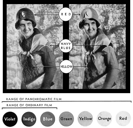
A few contributors have mentioned coloured lens filters, but a related issue which doesn't seem to have been mentioned is the spectral sensitivity of black and white film.
Not all black and white films are sensitive to all wavelengths of light. For example, the earlier orthochromatic films were sensitive to blue and maybe green light only, whereas the later panchromatic films were sensitive to all light. The latter didn't become the dominant medium until the 1940s, apparently.
Consequently, determining which shades of camouflage paint are relatively lighter or darker from black and white photographs might not be as straightforward as it seems. The colours of the paint and the spectral sensitivity of the film will also be a factor.
For example, consider this Kodak advertisement from the 1930's extolling the virtues of the new panchromatic film over the existing orthochromatic film:
Source: http://www.009.cd2.com/lynton_and_barns ... veries.htm
See also: http://photo.net/learn/optics/edscott/pss00030.htm
The left hand picture is taken with orthochromatic film, the right hand one with panchromatic film. The lady's clothes are the same, yet the shades appear very different.
A few contributors have mentioned coloured lens filters, but a related issue which doesn't seem to have been mentioned is the spectral sensitivity of black and white film.
Not all black and white films are sensitive to all wavelengths of light. For example, the earlier orthochromatic films were sensitive to blue and maybe green light only, whereas the later panchromatic films were sensitive to all light. The latter didn't become the dominant medium until the 1940s, apparently.
Consequently, determining which shades of camouflage paint are relatively lighter or darker from black and white photographs might not be as straightforward as it seems. The colours of the paint and the spectral sensitivity of the film will also be a factor.
For example, consider this Kodak advertisement from the 1930's extolling the virtues of the new panchromatic film over the existing orthochromatic film:
Source: http://www.009.cd2.com/lynton_and_barns ... veries.htm
See also: http://photo.net/learn/optics/edscott/pss00030.htm
The left hand picture is taken with orthochromatic film, the right hand one with panchromatic film. The lady's clothes are the same, yet the shades appear very different.
-
EJFoeth
- Posts: 2930
- Joined: Wed Jan 21, 2009 1:51 pm
Re: HMS Prince of Wales
Nice example image. The complications of ortho- and panchromatic film are discussed in most camouflage books and should indeed be kept in mind. It's probably one explanation for panels changing contrast from image to image (in addition to the direction of both lighting and the surface orientation towards the camera, not to mention lighting conditions, exposure time of the camera, variations in developing the image, quality of reproduction and scanning plus other enhancements by publishers (I always throw in a few digital filters)). The C/D contrast difference is nonexistent on some and quite clear on other images. However, what I have not been able to find is a similar picture as your example but for colour film. I can only guess to what extent the colours on the movie of HMS PoW are accurate.
-
linux
- Posts: 209
- Joined: Sun Apr 30, 2006 3:03 pm
Re: HMS Prince of Wales
The spectral sensitivity of black and white film presents not only a complication, but also an opportunity.
If you can identify both orthochromatic and panchromatic photographs of HMS Prince of Wales, then it might - might - be possible to infer which shades are warmer (red end of the spectrum), colder (blue end), and neutral (grey).
For example, consider this image:

Source: http://en.wikipedia.org/wiki/File:Rgb-c ... m_Khan.jpg
If you can identify both orthochromatic and panchromatic photographs of HMS Prince of Wales, then it might - might - be possible to infer which shades are warmer (red end of the spectrum), colder (blue end), and neutral (grey).
For example, consider this image:
Source: http://en.wikipedia.org/wiki/File:Rgb-c ... m_Khan.jpg

You will probably not find three similarly filtered photographs of HMS Prince of Wales, alas. But this does at least illustrate the potential opportunity presented by the different spectral sensitivities.A picture of Alim Khan (1880-1944), Emir of Bukhara, taken in 1911. This is an early color photograph taken by Sergei Mikhailovich Prokudin-Gorskii as part of his work to document the Russian Empire. Three black-and-white photographs were taken through red, green and blue filters. The three resulting images were projected through similar filters. Combined on the projection screen, they created a full-color image.