It is interesting and just possibly significant that the draught marks are in whiteelcejay wrote:Re Devonshire ....
And a lovely shot, too large to spoil by attaching...
http://imgur.com/B8LaxOc
HMS Prince of Wales
Moderators: MartinJQuinn, Timmy C, Gernot, Olaf Held, JWintjes
-
dick
- Posts: 681
- Joined: Wed Oct 24, 2007 1:44 pm
- Location: UK
Re: HMS Prince of Wales
You do not have the required permissions to view the files attached to this post.
-
dick
- Posts: 681
- Joined: Wed Oct 24, 2007 1:44 pm
- Location: UK
Re: HMS Prince of Wales
The true colour of B5 is pretty much what you see in shadow to the immediate left of the Bren. The lighter B5 areas are:elcejay wrote:
TR 325 throws me too. The blue paint on the barbette seems to be too light for B5...
a. in bright sunlight
and
b. will all have faded to a lighter tone with exposure to sunlight as ultramarine blues did.
Last edited by dick on Sat May 14, 2016 12:05 pm, edited 2 times in total.
-
dick
- Posts: 681
- Joined: Wed Oct 24, 2007 1:44 pm
- Location: UK
Re: HMS Prince of Wales
Dear Sutho,
I was told a few years ago by a reliable source that the entire RN WW2 WEM paint range was based on a set of �actual samples� but with the colours identified by the individual who supplied the samples. WEM were not given samples from an official RN/Admiralty document with the labelling by them. As Cag has been hinting, we may be dealing with misidentification of one or two of the paints by that individual.
B5 is of particular interest to us at the moment. Please compare the WEM B5 with their 507B.....
The pom pom in the photo TR318 you have just posted looks like the forwardmost one on the port side of KGV's upperworks. The blue behind it is on the side of the bridge and is the second darkest tone in the scheme and so must be B5. As you can see in this photo that tone seems also to have been painted on the upper parts of that pom pom mounting.
Best wishes
I was told a few years ago by a reliable source that the entire RN WW2 WEM paint range was based on a set of �actual samples� but with the colours identified by the individual who supplied the samples. WEM were not given samples from an official RN/Admiralty document with the labelling by them. As Cag has been hinting, we may be dealing with misidentification of one or two of the paints by that individual.
B5 is of particular interest to us at the moment. Please compare the WEM B5 with their 507B.....
The pom pom in the photo TR318 you have just posted looks like the forwardmost one on the port side of KGV's upperworks. The blue behind it is on the side of the bridge and is the second darkest tone in the scheme and so must be B5. As you can see in this photo that tone seems also to have been painted on the upper parts of that pom pom mounting.
Best wishes
You do not have the required permissions to view the files attached to this post.
-
Sutho
- Posts: 449
- Joined: Thu Dec 30, 2010 7:53 pm
Re: HMS Prince of Wales
So are you saying that it is possible that WEM now (Colour Coat paints with a new owner and company so not to confuse people), at the time WEM acquired them they could have been misidentified and that other blue colours in the range could well be B5 and B6 but just mislabelled or misidentified.dick wrote:Dear Sutho,
I was told a few years ago by a reliable source that the entire RN WW2 WEM paint range was based on a set of �actual samples� but with the colours identified by the individual who supplied the samples. WEM were not given samples from an official RN/Admiralty document with the labelling by them. As Cag has been hinting, we may be dealing with misidentification of one or two of the paints by that individual.
B5 is of particular interest to us at the moment. Please compare the WEM B5 with their 507B.....
The pom pom in the photo TR318 you have just posted looks like the forwardmost one on the port side of KGV's upperworks. The blue behind it is on the side of the bridge and is the second darkest tone in the scheme and so must be B5. As you can see in this photo that tone seems also to have been painted on the upper parts of that pom pom mounting.
Best wishes
-
508medway
- Posts: 179
- Joined: Wed Dec 17, 2014 2:10 am
- Location: Australia
Re: HMS Prince of Wales
Wouldn�t a simple comparison of the various Colorcoats paints assist in the exercise?
After all we know 507A, 507B and G10 were one and the same colour as was 507C and G45. Therefore, the Colorcoats paints should not only be the same tone but the same colour.
If you look at the attached, other paints should be the same or very similar tone as they have the same or very similar reflectance.
At the same time, we could look at other colours such as BS381C or FS595 colours where the reflectance is known to see how this compares to the tone of the Colorcoats paints.
e.g. the following BS381C colours have reflectance the same or similar to the RN colours.
227 Deep Brunswick Green 5.58%
671 Middle Graphite 9.4%
632 Dark Admiralty Grey 15.2%
283 Aircraft Grey Green 22%
631 Light Grey 33.3%
358 Light Buff 53.3%
Is this too simplistic an approach?
After all we know 507A, 507B and G10 were one and the same colour as was 507C and G45. Therefore, the Colorcoats paints should not only be the same tone but the same colour.
If you look at the attached, other paints should be the same or very similar tone as they have the same or very similar reflectance.
At the same time, we could look at other colours such as BS381C or FS595 colours where the reflectance is known to see how this compares to the tone of the Colorcoats paints.
e.g. the following BS381C colours have reflectance the same or similar to the RN colours.
227 Deep Brunswick Green 5.58%
671 Middle Graphite 9.4%
632 Dark Admiralty Grey 15.2%
283 Aircraft Grey Green 22%
631 Light Grey 33.3%
358 Light Buff 53.3%
Is this too simplistic an approach?
You do not have the required permissions to view the files attached to this post.
-
Sutho
- Posts: 449
- Joined: Thu Dec 30, 2010 7:53 pm
Re: HMS Prince of Wales
I know its not ideal but playing around with the colours in Adobe Lightroom can give this effect on the image. Again it is not a good way to do it and there are many factors to consider but anything run through a computer to get on the net has probably been through the same process and this is how tweaking the colours can chage things.
You do not have the required permissions to view the files attached to this post.
-
dick
- Posts: 681
- Joined: Wed Oct 24, 2007 1:44 pm
- Location: UK
Re: HMS Prince of Wales
No, that is not what I am suggesting. We can deal with other colours later but let�s try and nail B5. I am suggesting two representations of 507B were in the range perhaps - but no B5.Sutho wrote:
So are you saying that .... they could have been misidentified and that other blue colours in the range could well be B5 and B6 but just mislabelled or misidentified.
Here is a contemporary sketch of Hawkins by the artist Stephen Bone. He worked in the Naval Section of the Camouflage Directorate under Graham-Hall/Muncaster and so would have known the colours. Warship Perspectives (Vol 2 p 19) says the colours in this scheme were MS1, B5, B6 and 507C. However Hawkins was also reported on in the 1942 Scapa Observations and whilst the �dark� was not specified the other colours were: B5, MS4 and 507C (23 July 42 sortie with Graham-Hall and Goodden observing).
http://www.iwm.org.uk/collections/item/object/3213
Note yet again MS4 rather than B6 which may have wider implications.
As I said before when commenting on the KGV colour photos, there was no blue like this blue in the WEM range. And as I have also said and demonstrated before, the examples of B5 available in the UK archives are distinctly blue rather than grey.
In a final effort to convince you, here is a genuine sample of B5 from HMS Mutine from the archive at Portsmouth Dockyard set alongside WEM B5.
https://www.flickr.com/photos/136806092 ... ed-public/
It has perhaps faded (lightened) but makes interesting comparison with what we saw in TR325:
http://www.iwm.org.uk/collections/item/object/205123838
You do not have the required permissions to view the files attached to this post.
-
elcejay
- Posts: 102
- Joined: Sun Mar 30, 2014 3:33 am
- Location: Brisbane. Australia
Re: HMS Prince of Wales
Thanks Dick,
I am comfortable that B5 looks like you are showing us. Much brighter than I had expected, but the evidence is considerable and includes the previously posted detail from a Bone painting of Rodney in B5...
In the image of the sample of B5 you linked to in your last post, are the samples behind it original too? May we have shots of those too, please?
(Sutho, this may help with your flight deck question...http://artuk.org/discover/artworks/clea ... ew_as/grid)
Regards,
Lindsay
I am comfortable that B5 looks like you are showing us. Much brighter than I had expected, but the evidence is considerable and includes the previously posted detail from a Bone painting of Rodney in B5...
In the image of the sample of B5 you linked to in your last post, are the samples behind it original too? May we have shots of those too, please?
(Sutho, this may help with your flight deck question...http://artuk.org/discover/artworks/clea ... ew_as/grid)
Regards,
Lindsay
You do not have the required permissions to view the files attached to this post.
-
elcejay
- Posts: 102
- Joined: Sun Mar 30, 2014 3:33 am
- Location: Brisbane. Australia
Re: HMS Prince of Wales
Hello again, Dick.
How reliable is Charles Pears with colours? Another Official War Artist, as you would know better than me. This appears to be a copy of the Howe in Suez photos, so I am not sure of his knowledge of the colours, plus it is overcast so the colours are dulled. (If nothing else, it is a lovely high res image for a desktop wallpaper!)
https://upload.wikimedia.org/wikipedia/ ... 9-1946.jpg
Regards.
Lindsay
How reliable is Charles Pears with colours? Another Official War Artist, as you would know better than me. This appears to be a copy of the Howe in Suez photos, so I am not sure of his knowledge of the colours, plus it is overcast so the colours are dulled. (If nothing else, it is a lovely high res image for a desktop wallpaper!)
https://upload.wikimedia.org/wikipedia/ ... 9-1946.jpg
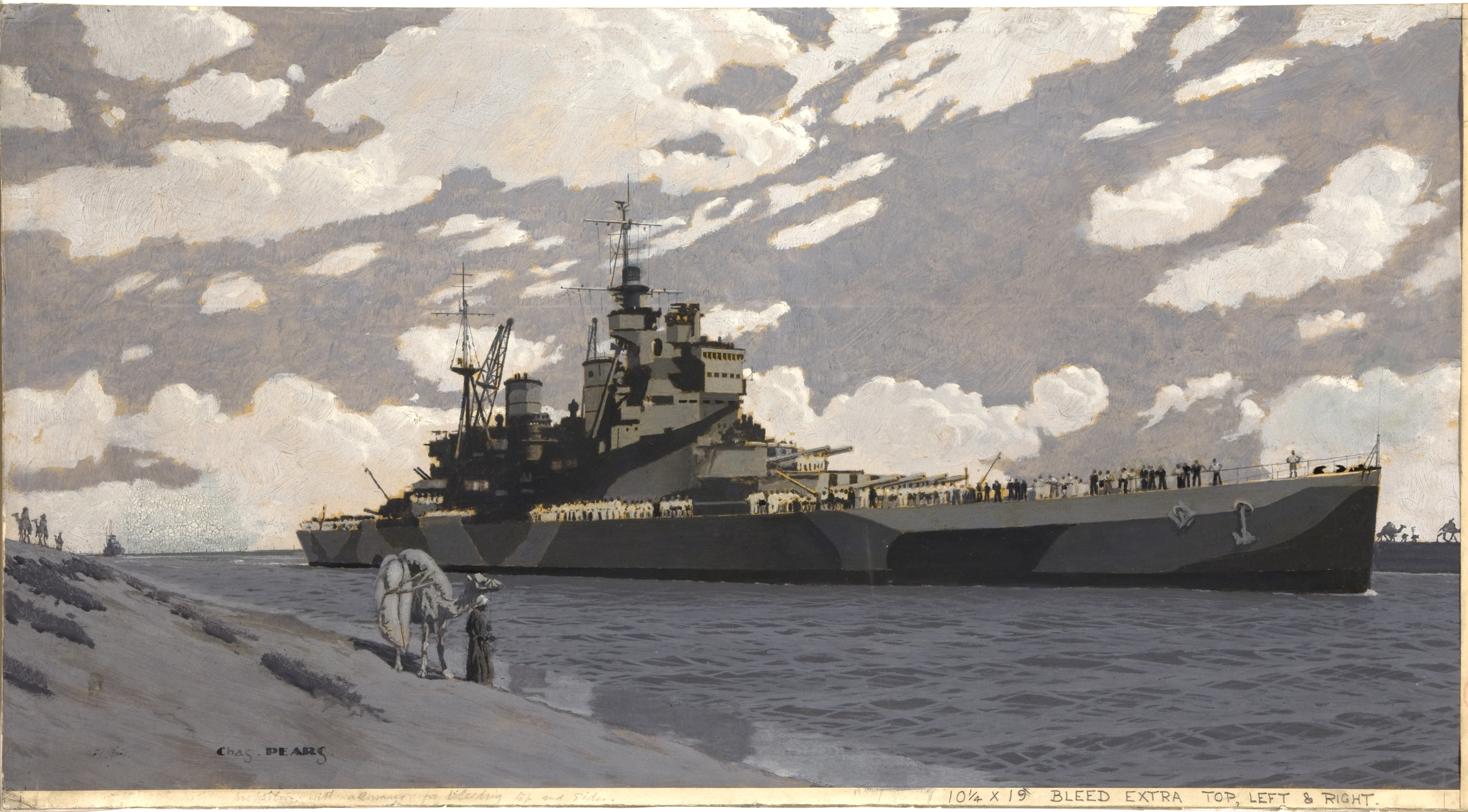
Regards.
Lindsay
-
dick
- Posts: 681
- Joined: Wed Oct 24, 2007 1:44 pm
- Location: UK
Re: HMS Prince of Wales
Dear Lindsay,
I think B5 when fresh was quite a dark tone (reflectance 15%) but lightened with time with exposure to the sun.
The "samples" behind that B5 chip are just a card I have painted with the various WEM paints (and sometimes the odd other: Humbrol, Xtracolor). I take the card with me when I visit the various archives so that I can compare what I find with them. I am assuming that it helps everyone here follow the debate by providing a datum from which the reproduction of colour can be assessed on everyone's PC monitors.
Re Chas Pears, I would treat his WW2 subjects with just a little more caution than Bone's. He would have been 62 in 1939 therefore I think you have to assume that many of his WW2 paintings are either works of imagination or based on photos or on interviews. I doubt someone his age would have gone on a Malta convoy for example or on the air attacks on Tirpitz in April 1944. That said I think he knew his ships and I think took care to try to get things right. He probably observed ships coming and going from ashore. There are certain things he probably did witness though such as the air raid on Falmouth in 1940 (and knowing the exact location well, that is a most interesting painting indeed).
That flight deck is on an escort carrier. Whilst I am comfortable that Bronze Grey (probably a dark sea-greenish colour in reality) was the specified colour for RN carrier flight decks from 1933 and into the early war years, after a few years the decks started to be painted in patterns and the range of non-slip colours widened so it is less easy to be specific. In the case of escort carriers my impression is all sorts of colours including wood and even USN flight deck stains are possible but others may know more.
That Howe painting looks clearly impressionistic. It and the IWM colour photos of her transitting the Suez Canal are probably not really of too much use to us in this discussion re PoW and the 1941-42 era paints - as EJ Foeth has already pointed out, this is after Howe's late 1943-early 1944 refit so she would presumably have been painted in paints from the 1943 onwards B & G range.
Best wishes.
I think B5 when fresh was quite a dark tone (reflectance 15%) but lightened with time with exposure to the sun.
The "samples" behind that B5 chip are just a card I have painted with the various WEM paints (and sometimes the odd other: Humbrol, Xtracolor). I take the card with me when I visit the various archives so that I can compare what I find with them. I am assuming that it helps everyone here follow the debate by providing a datum from which the reproduction of colour can be assessed on everyone's PC monitors.
Re Chas Pears, I would treat his WW2 subjects with just a little more caution than Bone's. He would have been 62 in 1939 therefore I think you have to assume that many of his WW2 paintings are either works of imagination or based on photos or on interviews. I doubt someone his age would have gone on a Malta convoy for example or on the air attacks on Tirpitz in April 1944. That said I think he knew his ships and I think took care to try to get things right. He probably observed ships coming and going from ashore. There are certain things he probably did witness though such as the air raid on Falmouth in 1940 (and knowing the exact location well, that is a most interesting painting indeed).
That flight deck is on an escort carrier. Whilst I am comfortable that Bronze Grey (probably a dark sea-greenish colour in reality) was the specified colour for RN carrier flight decks from 1933 and into the early war years, after a few years the decks started to be painted in patterns and the range of non-slip colours widened so it is less easy to be specific. In the case of escort carriers my impression is all sorts of colours including wood and even USN flight deck stains are possible but others may know more.
That Howe painting looks clearly impressionistic. It and the IWM colour photos of her transitting the Suez Canal are probably not really of too much use to us in this discussion re PoW and the 1941-42 era paints - as EJ Foeth has already pointed out, this is after Howe's late 1943-early 1944 refit so she would presumably have been painted in paints from the 1943 onwards B & G range.
Best wishes.
You do not have the required permissions to view the files attached to this post.
-
SovereignHobbies
- SovereignHobbies

- Posts: 1194
- Joined: Sat Feb 28, 2015 9:09 am
- Location: Aberdeenshire, Scotland, UK
- Contact:
Re: HMS Prince of Wales
Hi Dick,
This is a fascinating discussion. I know who supplied the samples to WEM way back when, but it is possible there was a misidentification.
Do you have a rate book recipe for B5? I'd like to make some up just out of curiosity.
My scans of AP507B and the Colourcoats B5 are quite similar.
AP507B:

B5:

This is a fascinating discussion. I know who supplied the samples to WEM way back when, but it is possible there was a misidentification.
Do you have a rate book recipe for B5? I'd like to make some up just out of curiosity.
My scans of AP507B and the Colourcoats B5 are quite similar.
AP507B:
B5:
James Duff
Sovereign Hobbies Ltd
http://www.sovereignhobbies.co.uk
Current build:
HMS Imperial D09 1/350
viewtopic.php?f=59&t=167151
Sovereign Hobbies Ltd
http://www.sovereignhobbies.co.uk
Current build:
HMS Imperial D09 1/350
viewtopic.php?f=59&t=167151
-
EJFoeth
- Posts: 2930
- Joined: Wed Jan 21, 2009 1:51 pm
Re: HMS Prince of Wales
This was confirmed earlier with a comparison between the tin lids that are---bliss---color accurate.
We/I have good reason to believe that the content for the tins for paints B5/B6/MS4/MS4a are suspect and an update of the paints is most welcome, however, we must move most carefully should that become a possibility.
We/I have good reason to believe that the content for the tins for paints B5/B6/MS4/MS4a are suspect and an update of the paints is most welcome, however, we must move most carefully should that become a possibility.
-
elcejay
- Posts: 102
- Joined: Sun Mar 30, 2014 3:33 am
- Location: Brisbane. Australia
Re: HMS Prince of Wales
Hello Michael,508medway wrote:After all we know 507A, 507B and G10 were one and the same colour as was 507C and G45. Therefore, the Colorcoats paints should not only be the same tone but the same colour.
If you look at the attached, other paints should be the same or very similar tone as they have the same or very similar reflectance.
If there is a record somewhere of the 507 series reflectance values, I would love to know what it says, please - it may well consign the following discussion to the recycle bin...
If the 507 paints are glossier than their replacements, wouldn't they have a higher reflectance value than their replacements? If so, would it be significantly higher or are they in the same ball park?
E.g. could 507A be overlapping into a 15 value, and 507B even higher? Could 507C be verging into 55 reflectance territory? If so, this could really affect our ability to distinguish those paints in B&W photos.
If I can approach it from a different angle...
CB3098 seems to tell us that of the 'G' paints, 507A is closest to G.10/MS.2, but I believe that 507A is more reflective than G.10/MS2. The next 'lightest' 'G' paint is G.20, so we know it is not that 'light'. But could it be around the 14 mark? In other words, it is closer to G.10 than G.20, so it is replaced by G.10, but it could be approaching the 15 mark, making it hard to distinguish from B.5/B.15 in a B&W photo.
The same with 507C, though with greater potential margin of reflectance. It was the 'lightest' 'G' type paint before the 'B' and 'G' series was issued. The 'lightest' 'G' paint is G.45, so 507C is logically replaced by that, but it could have been considerably 'lighter' and we wouldn't know it because there is no 'lighter' 'G' in CB3098 to give us a cut off point.
Forgive me any learners errors, please. I do hope that my fears are unfounded!
Regards,
Lindsay
-
elcejay
- Posts: 102
- Joined: Sun Mar 30, 2014 3:33 am
- Location: Brisbane. Australia
Re: HMS Prince of Wales
Some British Pathe/Critical Past of PoW Atlantic Charter meeting on Youtube...(overlaps in some)
https://www.youtube.com/watch?v=uK8XE0qA9Rs
https://www.youtube.com/watch?v=4_Ww-AwSnxI
https://www.youtube.com/watch?v=DqfHbu6o7HU
https://www.youtube.com/watch?v=Xe5VwPadcrw
https://www.youtube.com/watch?v=_1-hNq56oGA
Regards
Lindsay
https://www.youtube.com/watch?v=uK8XE0qA9Rs
https://www.youtube.com/watch?v=4_Ww-AwSnxI
https://www.youtube.com/watch?v=DqfHbu6o7HU
https://www.youtube.com/watch?v=Xe5VwPadcrw
https://www.youtube.com/watch?v=_1-hNq56oGA
Regards
Lindsay
-
elcejay
- Posts: 102
- Joined: Sun Mar 30, 2014 3:33 am
- Location: Brisbane. Australia
Re: HMS Prince of Wales
Cam related stills from above videos...light plays an interesting part in these shots.
And a some details...
I will post more tomorrow.
Regards,
Lindsay
And a some details...
I will post more tomorrow.
Regards,
Lindsay
You do not have the required permissions to view the files attached to this post.
-
elcejay
- Posts: 102
- Joined: Sun Mar 30, 2014 3:33 am
- Location: Brisbane. Australia
Re: HMS Prince of Wales
Hello Dick,
Thank you for the image of your sample card. Much appreciated.
Regards,
Lindsay
Thank you for the image of your sample card. Much appreciated.
Regards,
Lindsay
-
508medway
- Posts: 179
- Joined: Wed Dec 17, 2014 2:10 am
- Location: Australia
Re: HMS Prince of Wales
elcejay wrote:Hello Michael,508medway wrote:After all we know 507A, 507B and G10 were one and the same colour as was 507C and G45. Therefore, the Colorcoats paints should not only be the same tone but the same colour.
If you look at the attached, other paints should be the same or very similar tone as they have the same or very similar reflectance.
If there is a record somewhere of the 507 series reflectance values, I would love to know what it says, please - it may well consign the following discussion to the recycle bin...
If the 507 paints are glossier than their replacements, wouldn't they have a higher reflectance value than their replacements? If so, would it be significantly higher or are they in the same ball park?
E.g. could 507A be overlapping into a 15 value, and 507B even higher? Could 507C be verging into 55 reflectance territory? If so, this could really affect our ability to distinguish those paints in B&W photos.
If I can approach it from a different angle...
CB3098 seems to tell us that of the 'G' paints, 507A is closest to G.10/MS.2, but I believe that 507A is more reflective than G.10/MS2. The next 'lightest' 'G' paint is G.20, so we know it is not that 'light'. But could it be around the 14 mark? In other words, it is closer to G.10 than G.20, so it is replaced by G.10, but it could be approaching the 15 mark, making it hard to distinguish from B.5/B.15 in a B&W photo.
The same with 507C, though with greater potential margin of reflectance. It was the 'lightest' 'G' type paint before the 'B' and 'G' series was issued. The 'lightest' 'G' paint is G.45, so 507C is logically replaced by that, but it could have been considerably 'lighter' and we wouldn't know it because there is no 'lighter' 'G' in CB3098 to give us a cut off point.
Forgive me any learners errors, please. I do hope that my fears are unfounded!
Regards,
Lindsay
Lindsay,
The reflectance values I used for the 507s and MS series as well as the US colours came from Teddington from memory. The paint research people did a series of tests of paints from dockyards, paint manufacturers etc. circa 1942. I have it listed as coming out from ADM 212 124. In it were several tables of the testing results versus what the reflectance should be with comments about whether the results were considered acceptable. Those tables are buried on my PC somewhere. I simply put them into an excel table some time ago to be able to compare them. They were in Dakin�s files in the National Archives.
The original Home Fleet Dark Grey was 507B which was the glossiest with the gloss level going down through 507A then G10. The level of gloss might alter the reflectance of the colours but would the impact of salt spray from the sea affect all the paints we are looking at? Could/would it dull all of them?
The records say that 507A and G10 are one and the same colour only the level of gloss being different. Similarly 507C and G45 are the same colour.
As for the MS range, no idea, as from what I know, we have never found paint formulae for these colours. Given the description and reflectance value, some of the MS range are probably the same as the B & G range but we haven�t any documentary proof yet. Teddington in the tests stated that the B & G colours replace the original designations of MS1 etc. which seems to imply they are the same. However, Dick�s comments on the actual paint samples shows this is not necessarily so. We can just hope the MS colours turn up in a Rate Book one day or an Admiralty AFO, CAFO, memorandum.
The RN issued paint formulae for its colours from the early 1900s, so I find it hard to believe that they suddenly did nothing for the MS series, and then did them for the B &G series. The formulae for the MS series is rapidly becoming our Holy Grail.
 ?
?Regards,
Michael
You do not have the required permissions to view the files attached to this post.
-
elcejay
- Posts: 102
- Joined: Sun Mar 30, 2014 3:33 am
- Location: Brisbane. Australia
Re: HMS Prince of Wales
Thanks Michael - I am now pretty comfortable with the 507 series reflection factors after reading your post.
Your comment about the effects of salt build up on a surface (acting like a matt, perhaps satin, varnish overall) are interesting. I hadn't thought of that.
Some related thoughts... The 507s would have retained their reflectivity for longer than other series due to the enamel (your reference for that is attached below, thank you). It would also mean that they would attract less salt build up as the glossiness would tend to promote water run of by comparison to the other paints. The longer the paints had been on, the greater the difference would have been. Could the combination of those factors explain why the diagonal slash panel at port aft on PoW, if it is 507C as we suspect, shines like a beacon at times? Would I be right to assume that paint wear at that point of the ship would be significantly less than at the bows (as photo evidence shows), and perhaps midships (which is pure speculation on my part)? Less wear, hardier and glossier paint, and less salt build up = considerably higher reflectance to the more matt paints around it?
Regards,
Lindsay
Your comment about the effects of salt build up on a surface (acting like a matt, perhaps satin, varnish overall) are interesting. I hadn't thought of that.
Some related thoughts... The 507s would have retained their reflectivity for longer than other series due to the enamel (your reference for that is attached below, thank you). It would also mean that they would attract less salt build up as the glossiness would tend to promote water run of by comparison to the other paints. The longer the paints had been on, the greater the difference would have been. Could the combination of those factors explain why the diagonal slash panel at port aft on PoW, if it is 507C as we suspect, shines like a beacon at times? Would I be right to assume that paint wear at that point of the ship would be significantly less than at the bows (as photo evidence shows), and perhaps midships (which is pure speculation on my part)? Less wear, hardier and glossier paint, and less salt build up = considerably higher reflectance to the more matt paints around it?
Regards,
Lindsay
You do not have the required permissions to view the files attached to this post.
-
EJFoeth
- Posts: 2930
- Joined: Wed Jan 21, 2009 1:51 pm
Re: HMS Prince of Wales
I'm not exactly sure how color-accurate the movies below are, but this is
AP507A
AP507B
AP507A
AP507B
-
elcejay
- Posts: 102
- Joined: Sun Mar 30, 2014 3:33 am
- Location: Brisbane. Australia
Re: HMS Prince of Wales
Thanks for the videos, EJ.
Some more stills: Regards,
Lindsay
Some more stills: Regards,
Lindsay
You do not have the required permissions to view the files attached to this post.